
Asset Price Inflation — The Question Is Right, the Chart Is Not
The reasoning goes like this. Money grows faster than output. A growing pile of money faces a limited pile of things. For years, consumer prices barely showed it. So the money must have gone somewhere else — into stocks, real estate, gold, Bitcoin. Asset price inflation.
That is a good question, and it is better than the chart usually used to answer it. The relationship exists. It just works differently from what two overlaid lines suggest — and in one important place it runs backwards.
The part that holds
The portfolio rebalancing channel is not a fringe theory. It is stated intent. When a central bank buys bonds, the private sector afterwards holds fewer bonds and more bank deposits. Anyone who wanted a particular mix of safety and yield still wants it, and has to buy something else to get back there. Ben Bernanke described exactly this path at Jackson Hole in 2010: the strategy "relies on the presumption that different financial assets are not perfect substitutes in investors' portfolios, so that changes in the net supply of an asset available to investors affect its yield and those of broadly similar assets."
The second correct part is the Cantillon effect, named after an 18th-century Irish-French banker: new money enters the system at particular points, and prices adjust there first. Anyone holding assets sits closer to that point than anyone earning wages. That is not ideology, it is a claim about sequence.
Together those give you a mechanism you cannot argue away.
The part that works differently than assumed
The phrase "the money has to go somewhere" is misleading, but not in the way you might first think.
As accounting, the objection is correct: buy 100,000 of stock and you hold stock, while the seller holds the 100,000. The money supply is unchanged. No money went into equities.
But it does not follow that nothing happens. Quite the opposite.
Only a fraction of the shares ever trades, yet the price of that fraction revalues the entire outstanding stock. Buy one percent of the shares and you move the price — and the other ninety-nine percent are worth more afterwards too.
Before: 100,000 in stock and 100,000 in cash. After: 100,000 in cash and perhaps 102,000 in stock. Paper wealth has appeared without a single unit of money being created.
That is asset price inflation, literally.
And it has been measured
Xavier Gabaix and Ralph Koijen open their paper with exactly this question: an investor sells one dollar of bonds and buys one dollar of stocks. What happens to the valuation of the aggregate market?
The textbook answer is: nothing. The price is the present value of future payouts, and a reallocation does not change that.
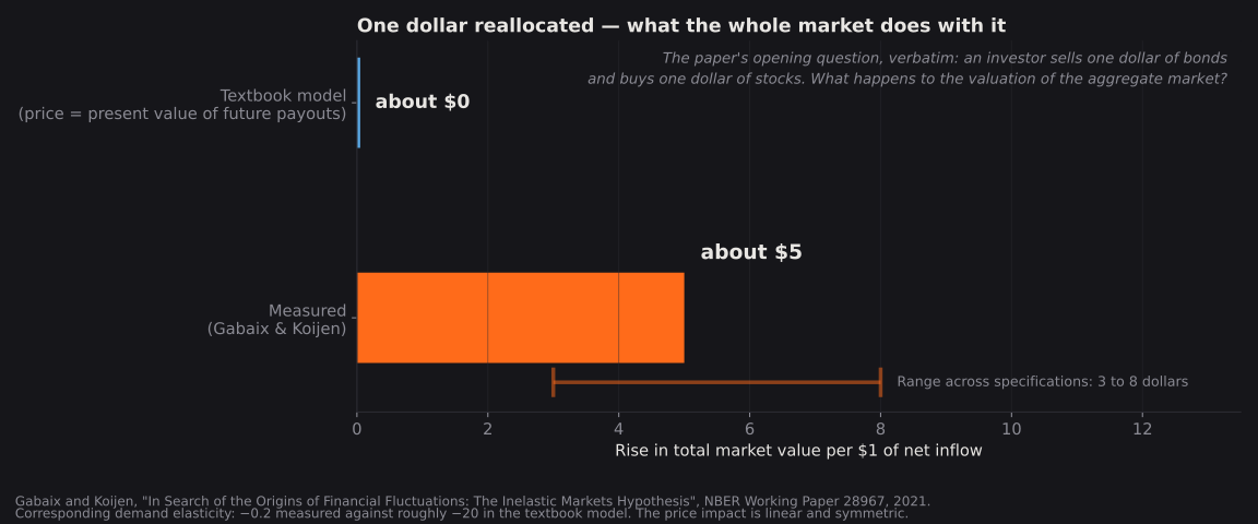
Their result: aggregate market value rises by about five dollars. Across specifications the estimate runs from three to eight.
The corresponding demand elasticity is even starker. When the price of the market portfolio rises five percent, quantity demanded falls by one percent. The textbook model expects roughly a hundred times that.
The reason is institutional. The decisive holders — index funds, pension funds, insurers — operate under mandates that hold their equity share within narrow bands. When demand shifts, almost nobody can take the other side. So the price has to travel a long way before the market clears.
Their measure of capital flows into the market is, by their own account, strongly correlated with realised returns and with survey expectations of returns — and only weakly correlated with macroeconomic growth.
What follows from this, and what does not
So the mechanism is not merely real, it is quantified. Dismissing it with the accounting argument is too easy. We did exactly that in an earlier version of this piece.
Two limits belong with it nonetheless.
It is paper wealth. The same paper notes the price impact is linear and symmetric: selling pushes just as hard the other way. The 102,000 cannot be realised by everyone at once.
And the multiplier says what a net flow does — not where it comes from. In a closed system somebody sold. Genuine net inflow into the asset class comes from negative net issuance through buybacks, from foreign buying, or from households shifting their allocation away from bonds and cash.
Which brings you to the variable that actually matters: not the money stock, but the shift in portfolio allocation.
And that, incidentally, is precisely what central bank bond purchases produce. They remove bonds from the private sector, the allocation has to shift toward equities, and it meets a market that barely gives way. It is literally the experiment in the paper's opening line.
And in one place it runs backwards
In a credit money system, most money is created when banks lend. The Bank of England set this explicitly against the textbook account in its 2014 paper "Money creation in the modern economy": deposits do not enable loans, loans create deposits.
For housing that means: a mortgage creates money supply. When prices rise, mortgages get bigger, and M2 grows with them. Causality runs from prices to money, not the other way.
On a chart the return trip looks exactly like the outward one. Two lines rising together do not tell you which is pulling.
Why the chart cannot settle the question
So to the presentation itself. We generated two series that provably have nothing to do with each other — every step drawn independently, no market involved, no shared cause. Both drift slightly upward, and that is all.
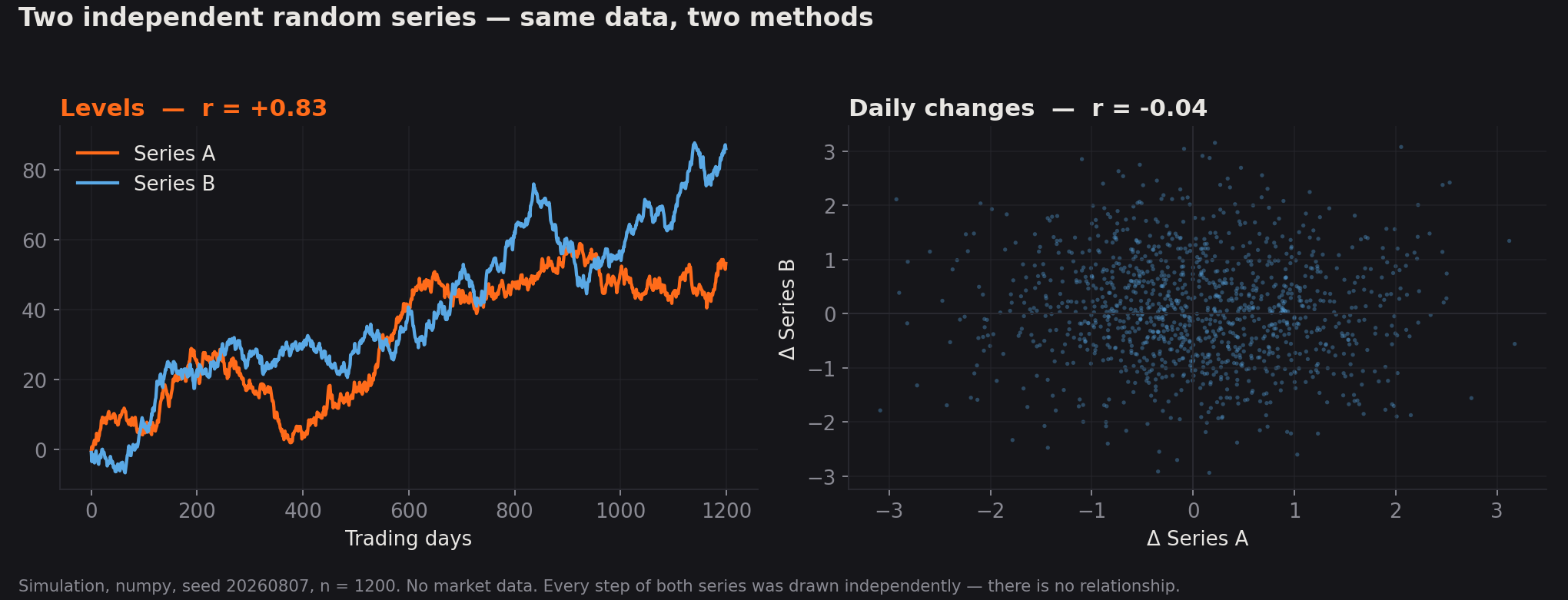
On the left, the lines themselves: correlation +0.83. On the right, the same data as daily changes: −0.04.
To make sure that wasn't a lucky draw, 2,000 repetitions with fresh series each time:
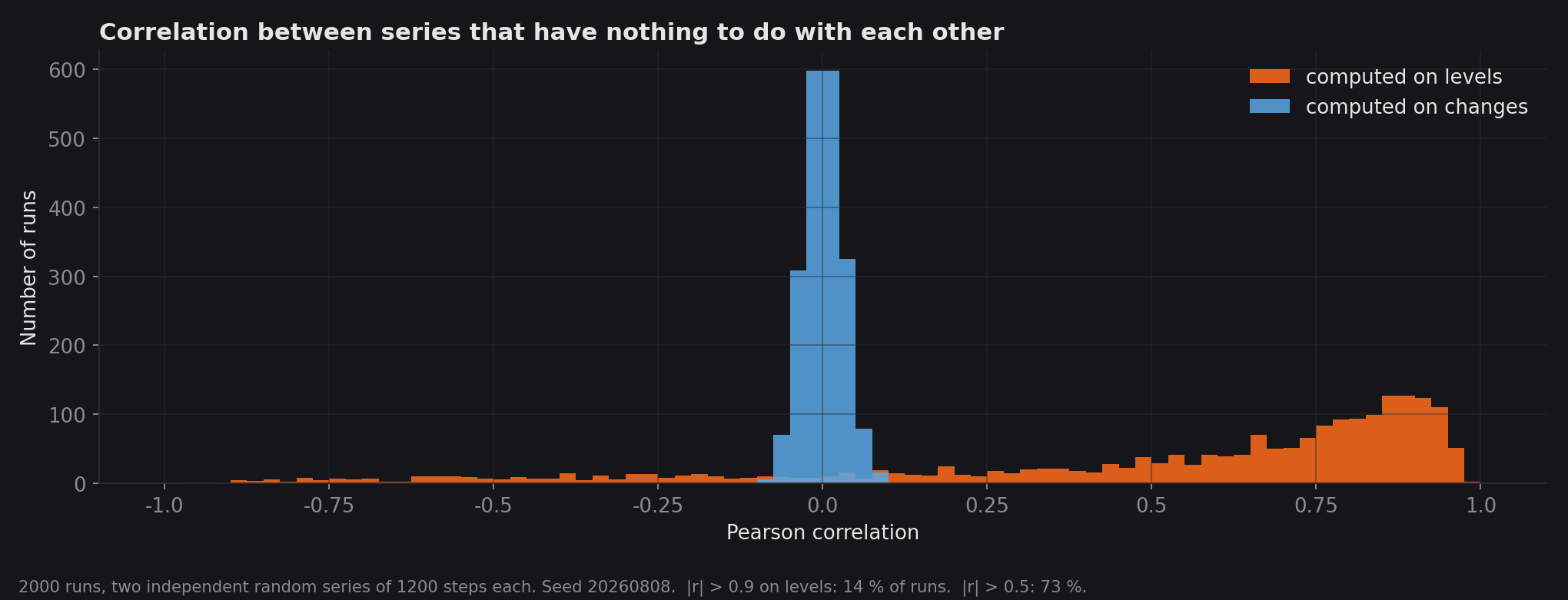
On levels, the typical absolute value is 0.73; 73 percent of runs exceed 0.5 and 14 percent exceed 0.9. On changes, the typical value is 0.02, and the largest across all 2,000 runs is 0.10.
This is called spurious regression and has been in the textbooks since Granger and Newbold. Two series rising over the same period correlate highly because both rise.
The point is not that the relationship therefore doesn't exist. The point is that this picture cannot show it — it looks the same when there is nothing there.
What is left once you compute on changes
We have no equity data; our platform only tests crypto. But we measure Bitcoin daily against thirteen macro components, computed on changes.
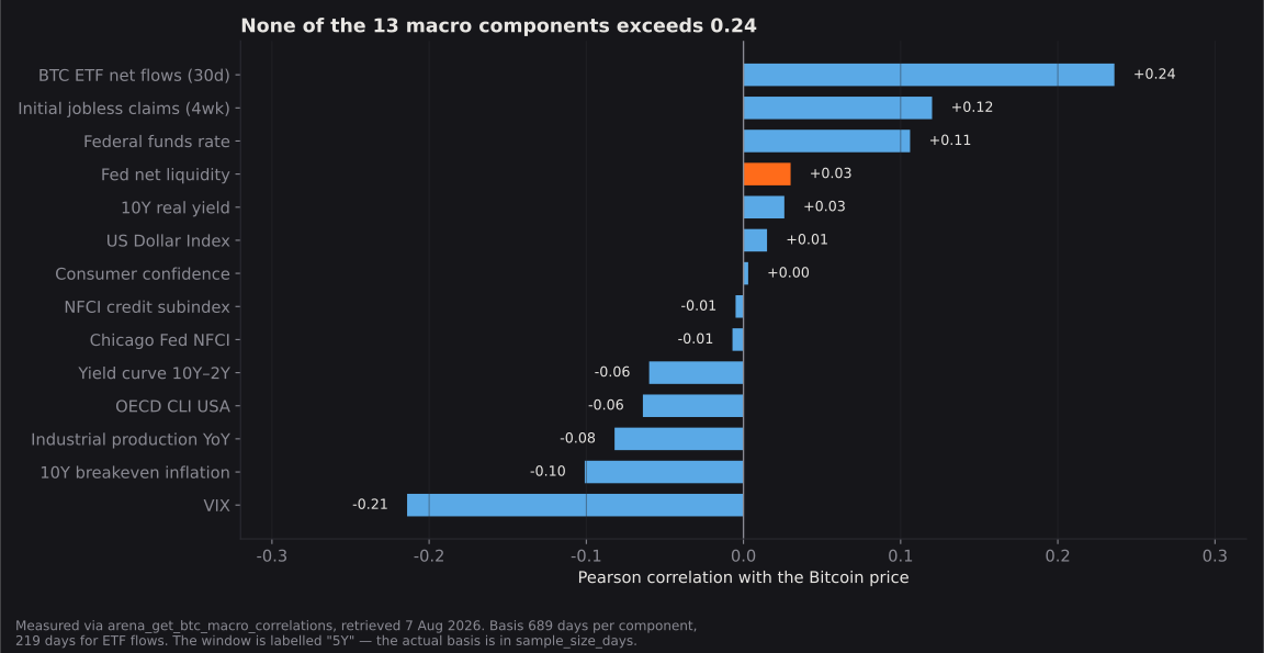
Fed Net Liquidity against Bitcoin: +0.03. The strongest value in the field is the VIX at −0.21, and that is still weak.
With the caveat attached: the window is labelled "5 years" in the tool while the actual basis is 689 days. And these carry no lag — anyone arguing the effect only shows up months later has not been refuted by this.
One side finding we are not selling: in the quartile breakdown, Bitcoin did better when Fed liquidity was low than when it was high. Roughly 172 days per quartile, heavily overlapping, no benchmark over the same window — nothing can be drawn from it. It is here because anyone treating quartile spreads as an argument has to take this one too.
The years it came apart
US M2 peaked in March 2022 at 21.8 trillion dollars and fell 4.8 percent to its trough in October 2023 — the only meaningful contraction since the series begins in 1959. The S&P 500 rose 24.2 percent in 2023 and 23.3 percent in 2024, both excluding dividends.
A shrinking money supply, and just over fifty percent in gains.
Japan gives the hardest case — but only over one particular window. From 1990 to 2012 the Japanese money supply grew 79 percent while the Nikkei 225 fell 73 percent. Its December 1989 high was not reached again until February 2024, thirty-four years later.
And to keep it honest: from 2013 on, through the most aggressive monetary policy in Japan's postwar history, the same index rose more than 550 percent. Japan does not refute the thesis. It shows the same money supply producing opposite outcomes in two periods.
"Hard assets" are four different things
This is where the thesis is most likely to beat itself. Stocks are not a hard asset. They are a claim on future cash flows and therefore maximally rate-sensitive. Real estate is leveraged and more sensitive still. Gold and Bitcoin have no cash flows at all.
In 2022, under one monetary environment: gold roughly flat (−0.7 percent), equities −19.4 percent, Bitcoin −64.2 percent — and US housing up 5.8 percent in nominal terms, −0.6 percent in real terms.
Four assets supposedly responding to one cause, with four different outcomes in one year — a spread running from plus six to minus sixty-four percent.
The experiment that rescues the thesis
And now the part that supports the original question — using the same argument that dismantles the chart.
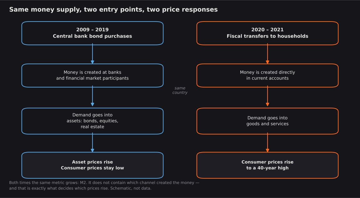
From 2009 to 2019, new money was created mostly through bond purchases. It entered at banks and financial market participants. Result: high asset prices, low consumer prices.
In 2020 and 2021, money arrived through fiscal transfers, straight into current accounts. Result: consumer price inflation not seen in forty years.
Same country, same headline metric, two entry points, two entirely different price responses.
That is the Cantillon effect in clean form, and it confirms the core of the original question: where new money enters decides which prices rise.
And it is exactly where the money-supply metric fails. M2 adds both channels into one number that no longer contains the difference. A metric that aggregates away the decisive mechanism cannot measure it, however good the chart looks.
What we consider defensible
Over very long horizons, nominal asset prices track nominal economic output, because both are measured in the same shrinking unit. That is nearly a definition and yields exactly one practical statement: over thirty years, cash is the worst choice. About timing it says nothing.
The distributional claim is strong. Those who own assets benefit from new money earlier than those who earn wages. That is real, it matters socially, and it holds whether or not a trading rule follows from it.
What does not hold is the step in between: from "monetary policy changes relative prices" to "when M2 rises, hard assets rise." In between sit interest rates, the entry channel, velocity, credit demand and risk appetite. Any of them can cancel the effect, and none of them appears on the chart.
The honest sentence is this: monetary policy changes the relative price of money against everything else. How much and when depends on things the money aggregate does not contain.
Three questions for the next chart like it
Levels or changes? With levels the high correlation is built in.
Through which channel was the money created? If that isn't stated, the metric is unfit for the question.
How many independent cases? Not how many days — how many monetary cycles. Since 1970, perhaps five.
The simulation code fits in twenty lines, seed 20260807, if anyone wants to check.