
The Wyckoff schematic is one of the best-known images in trading. Anyone who has looked at charts for a while has met it: five phases from A to E, a trading range, and a breakdown that turns out to be a trap.
It is also among the least examined — under its own name, at least. The mechanism behind it has been studied, and in a way that contradicts Wyckoff at one decisive point.
This piece does two things. It explains the schematic. And it fixes the rules by which we will test part of it — published before we have calculated a single number. The reason for that sequence is the actual point, and it comes at the end.
Where it comes from
Richard Demille Wyckoff, 1873 to 1934, was a New York broker who founded the Magazine of Wall Street. His core idea was simple and, for its time, unusual: large participants cannot build positions all at once. Buying heavily drives the price against yourself. So you accumulate over time, as quietly as possible, and you leave traces in price and volume while doing it.
Wyckoff called this imagined large operator the Composite Man — a thinking device, not a person. Reading the market means asking what that operator is doing.
One point of accuracy: the schematic with letters A through E and the familiar abbreviations, as taught today, does not come directly from Wyckoff in that form. It emerged in the teaching tradition that followed him. "According to Wyckoff" usually means this later codification.
The schematic
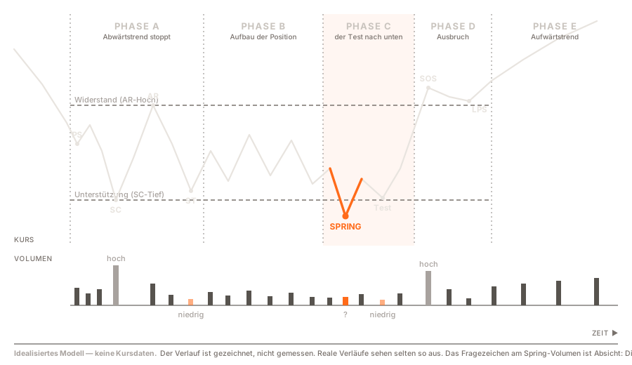
First and most important, which is why it also appears in the image: this is a drawn path, not price data. Real charts rarely look like this. An idealised model is a teaching device — it shows what to look for, not what you find.
The five phases
Phase A — the downtrend stops. After an extended decline, real demand enters for the first time. Preliminary support is the first sign: price falls, but volume picks up and the decline slows.
Then the selling climax. A high-volume flush, often panicky, printing a marked low. That low is where the patient buyers step in.
An automatic rally follows. With selling pressure exhausted, price bounces without needing much buying power. The high of that rally sets the ceiling of the range everything else happens inside.
Finally the secondary test: price returns toward the low on noticeably lower volume. Lower volume means there is barely any supply left.
Phase B — the long boring part. Price oscillates between support and resistance. This is where the model says the position gets built, and it is the dullest stretch. It can run for months, which is exactly why most people give up here.
Phase C — the test to the downside. This is where it gets interesting, and it is what the second half of this piece is about.
Phase D — the breakout. Price leaves the range upward. The sign of strength is a move above resistance on markedly higher volume. The last point of support is the pullback that follows and holds above the old ceiling — resistance has become support.
Phase E — the uptrend. What follows is no longer Wyckoff. It is just a trend.
Distribution runs the same shape mirrored: a buying climax instead of a selling climax, a failed breakout upward instead of downward.
The Spring
The Spring is the schematic's best-known event, and the reason many people take up Wyckoff at all.
Price drops below the range support. To anyone holding a stop just underneath, that looks like a breakdown — stops trigger, selling happens. Then price turns, closes back above support, and the breakdown was never one.
In Wyckoff's account this is not accidental. The large operator collects the last available supply there, from precisely the people the break just shook out.
The Spring has one property the phases do not: it is a point in time. It happens on a bar or it does not. You can count it.
What the research actually says
We searched for peer-reviewed work that operationalises Wyckoff events and measures what follows them. Under that name we found nothing solid.
One paper exists, and we are not using it as evidence: the journal was removed from the Directory of Open Access Journals for not adhering to best practice, and the Norwegian publication register rates it at level 0. That does not make the paper wrong. It means its appearance there says nothing about its quality — and a citation that supports nothing is not a citation.
For a method taught for a century, that is a striking finding in itself.
The mechanism, by contrast, is well studied
Wyckoff's name just isn't on it.
For Stop-Loss Orders and Price Cascades in Currency Markets (Journal of International Money and Finance, 2005), Carol Osler analysed minute-by-minute exchange rates for dollar-mark, dollar-yen and dollar-sterling from January 1996 to April 1998. She uses a finding from her own earlier work: stop-loss and take-profit orders cluster at round numbers, and they do so predictably.
That makes something measurable which is otherwise invisible. If you know where the orders sit, you can watch what price does when it arrives there.
Two results matter for us.
First: at take-profit clusters, price reverses noticeably often. These orders work against the move — selling into strength, buying into weakness.
Second: after crossing stop-loss clusters, price accelerates. These orders work with the move. Osler shows the response to stop clusters is larger and lasts longer than the response to take-profit clusters — evidence that stops fire in waves, each triggering the next.
She calls it a price cascade. And she cites an example any chart reader will recognise: on 7 March 2002 dollar-yen fell over three percent with no news at all, as successive waves of stops triggered — first on the break of 130.50, then at 130.
And here it gets uncomfortable for Wyckoff
The two order types sit in different places. Take-profit orders sit at the level. Stop-loss orders sit just beyond it — where someone exits if the level fails.
The Spring happens in that second zone. Price goes below support, into exactly the region where stops cluster.
And Osler's finding for that zone is: it accelerates. Not: it reverses.
That is not a footnote. It is the central claim of a paper that has been cited for twenty years. The documented order structure predicts, for the price region below support, the opposite of what the Spring asserts.
What that means for our test — and why it improves it
You could read that as a refutation. We read it as the reason to measure at all.
Both statements can hold at once. Osler describes what happens on average when stops trigger. Wyckoff describes a special case: the cascade starts, but someone stands on the other side and absorbs the supply.
And here is the decisive property of our rule. It only fires once the close has already reclaimed support. It therefore does not predict the reversal — it selects precisely those cases where the cascade failed to run.
Which means the real question is no longer "does price reverse after a break". Osler has largely settled that it usually does not. The question is: does the subset where the cascade did not run behave differently afterward than the market as a whole?
That is a narrower, sharper, answerable question. Without Osler's paper we would not have framed it this way.
What does not transfer cleanly
Four points where the comparison strains.
Osler's data is foreign exchange from 1996 to 1998, minute-by-minute, in major pairs. We are testing crypto on daily bars in 2026 — different participants, different hours, different market structure.
She identifies levels via round numbers. Wyckoff supports are structural points, meaning prior lows. That orders cluster at round numbers is documented; that they cluster the same way at swing lows is plausible but not thereby shown.
Osler herself writes that her statistics cannot prove causation. She checks two alternative explanations — central bank intervention and chaotic price processes — and finds both unlikely. That is all.
And the general picture stays sober: in their survey, Park and Irwin review 95 modern studies of technical analysis, 56 positive, 20 negative, 19 mixed — noting that the profits were mainly demonstrable up to the early 1990s, and flagging publication bias explicitly.
Why the schematic as a whole resists testing
We looked at two widely used Wyckoff scripts for TradingView, both public, both under the Mozilla Public License. One tries to detect the entire schematic, with every event and a state machine across the phases. The other does exactly one thing: it marks Springs.
The difference is instructive, and it is not about the authors' care.
Phases are states, not events. The larger script carries a variable that travels from "Phase A" through to "Phase E", driven by roughly twenty hard-coded thresholds. The state depends on the whole path price took to get there. It never resets and it never expires.
So you cannot say: "there were 47 Phase C events, and on average this followed." There are no 47 events. There is a state that was entered at some point and gets overwritten by something else at another.
The smaller script gives you the opposite: one condition, one timestamp, one trigger, and each support level fires at most once. That can be counted and set against what happened next.
Testability is a property of scope, not of diligence. Both scripts are competently written. Only one asks a question that can have an answer.
Which is why we are testing the Spring and not the schematic.
The rules — fixed before we compute
Here is the part the rest of this piece rests on.
If you code a rule, look at the result, then adjust the parameters, you will always end up finding something. Not through dishonesty — it happens on its own. You try a different pivot length because the first "didn't look right". You nudge the volume threshold. Five passes later you have a rule that works on exactly this data and nothing else.
The only mechanical protection is writing the rules down beforehand and publishing them. After that they cannot be changed quietly.
Here they are:
What a pivot is. A bar whose low is below the six bars before it and no higher than the six after. That means a pivot is only confirmed six bars later. This is deliberate and it is honest: it was not known before, so it may not be used before.
What a valid level is. A confirmed pivot low that was also the low of its trailing twenty bars. That puts it at the bottom edge of a range rather than somewhere in the middle.
What a Spring is. Price trades below a valid level but closes above it. The low must also be the lowest of the trailing twenty bars, and the level must not have been broken more than three times before — a level broken four times is not support. Each level fires at most once.
When entry happens. At the close of the bar the Spring occurs on. Not at the low. The low was not tradeable at the moment of the decision.
What gets measured. Price movement over 5, 10 and 20 bars afterward, each net of 0.1% costs per side (fee plus slippage, conservatively above the Binance taker level). No optimised exit, no stop — otherwise the study answers a different question.
What it gets measured against. The unconditional price movement over the same horizons, same window, same universe. This is the single most important item on the list. A positive return after a Spring says nothing until you know what the market did anyway over the same stretch.
On which universe. Bitcoin plus the nine most-traded USDT pairs on Binance — selected by their trading volume in December 2019, not by what survived to today. That is deliberate: build the list from today's survivors and you are only testing the winners and calling it alpha. The frozen list, fixed before any number exists:
BTC, ETH, MATIC, BNB, TRX, XRP, EOS, LTC, BCH, VET — each against USDT.
That MATIC ranked third back then and VET tenth is exactly the point: today's list would look different. We take the one from then.
And on volume we run three variants, because the teaching is not unanimous here. A Spring is read one way as absorption by large buyers — which implies high volume. And another way as evidence that no supply remains — which implies low. Both readings are common. So we measure with no volume condition, with high volume, and with low. If both variants show the same thing, volume is not doing the work.
Both scripts we examined, incidentally, test only for high volume. Neither notes that this was a choice.
And a control group
This is the part that surprised us while writing these rules.
We looked at a third Wyckoff script. It defines the Spring like this: RSI rises above 30. That is all. No price level, no support, no trading range, no break with recovery, no volume. An oscillator crossing with a Wyckoff label on it.
It would test perfectly well. You could run it through the same machine — sample gate, benchmark, multiple-testing correction, prefix test — and get a clean number. For a question that has nothing to do with Wyckoff.
Which exposes a gap we had not named. Everything else we check concerns the reliability of a result: is the number reproducible, is future information leaking in, does it hold against the right comparison. None of those checks asks whether the thing measured is the thing on the label.
A backtest can be methodologically flawless and still measure the wrong thing. That is not an edge case. It is probably the more common failure — because it leaves no trace in the metrics.
So we are adding the RSI crossing as a control group. Same horizons, same baseline, same costs, same gates.
The point is the difference. The placebo measures plain reversion from oversold. Our Spring additionally measures a price-level structure — the break and recovery of a confirmed support. Whatever the Wyckoff definition contributes on its own is exactly the gap between the two. Without a control, that cannot be separated.
How we will read the result
Fixed in advance too, because otherwise any configuration can be narrated into a finding afterward.
| Spring | Placebo | What we conclude |
|---|---|---|
| Effect | none | The price-level structure contributes something |
| Effect | effect, similar size | The Spring mostly measures oversold reversion. The label would be decoration |
| Effect | effect, clearly smaller | Both work, and the structure adds on top |
| none | none | Neither rule shows anything here |
| none | effect | The simpler rule beats the more elaborate one |
That last row is the outcome we would least enjoy. It is in the table for exactly that reason.
What counts as "no effect"
Fixed in advance too, otherwise it can be arranged afterward:
If the difference between conditional and unconditional price movement does not exceed one standard error, the result is "no detectable effect". Regardless of sign.
Plus three gates. Under 30 Springs per variant the result is an anecdote and gets reported as one. Events must spread across at least twelve distinct months — forty Springs occurring in the same month are one observation, not forty. And because we test twelve combinations, we correct for multiple testing — via the deflated Sharpe with twelve trials, the same procedure we apply platform-wide against chance findings. Test twelve variants and show the best, and you will always find something.
And one last mechanical test: the Spring list is generated twice — once on the full history, once on a truncated opening stretch. The overlapping Springs must be identical to the date. If even one differs, future information has leaked into the detection, and the computation does not proceed. That is a file comparison, not a judgement call.
The commitment
We will publish the result whatever it is.
Three outcomes are possible and all three are accepted in advance: the effect is detectable. There is none. Or the rule finds too few Springs to say anything at all.
The third would be the least spectacular and will be reported as fully as the other two.
What this test cannot do
Four things belong on the record, or we overreach what the data supports.
We test one implementation. The pivot length of six is the surveyed script's default, not derived from the theory and not a standard value — TradingView's built-in pivot default is five. A different value would produce different Springs. Which is why we fix it beforehand and do not vary it: the result holds for that value and no other.
We are not testing discretionary Wyckoff reading. A human with context decides differently from a rule.
We cover crypto only, and daily bars only.
And a negative result would mean: this rule shows no detectable effect on this data. It would not mean Wyckoff was wrong.
Why we do it this way
Because a result justified after the calculation is worthless — and because you cannot see that from the outside.
A backtest whose rules were written after the first look at the numbers looks exactly like one whose rules came first. Same chart, same metrics. The difference is the order, and the order does not appear anywhere in the output.
So it appears here instead. Beforehand, with a date on it.
The result follows.
This piece explains a model and fixes the rules of a planned analysis. It contains no results, no investment advice, no recommendation, and no forecast.
Sources: Carol L. Osler, Stop-Loss Orders and Price Cascades in Currency Markets, Journal of International Money and Finance 24(2), 2005, pp. 219–241, DOI 10.1016/j.jimonfin.2004.12.002 · Carol L. Osler, Currency Orders and Exchange Rate Dynamics: An Explanation for the Predictive Success of Technical Analysis, Journal of Finance 58(5), 2003 · Cheol-Ho Park and Scott H. Irwin, What Do We Know About the Profitability of Technical Analysis?, Journal of Economic Surveys 21(4), 2007, pp. 786–826 · Richard D. Wyckoff, writings in the Magazine of Wall Street and course material on market analysis, 1910s–1930s · Hank Pruden, The Three Skills of Top Trading, Wiley 2007, on the schematic's modern teaching form · "Wyckoff Schematic" by kingshukghosh71, TradingView, MPL 2.0, accessed 24 July 2026 · "Wyckoff Springs" by QuantVue, TradingView, MPL 2.0, accessed 24 July 2026 · "Wyckoff Accumulation Distribution" by faytterro, TradingView, MPL 2.0, accessed 24 July 2026 · StockCharts ChartSchool, The Wyckoff Method: A Tutorial (chartschool.stockcharts.com) — credits the accumulation/distribution schematics to Roman Bogomazov, edited by Hank Pruden; the "back-up" terminology to Robert Evans · Price data for the planned analysis: Binance.